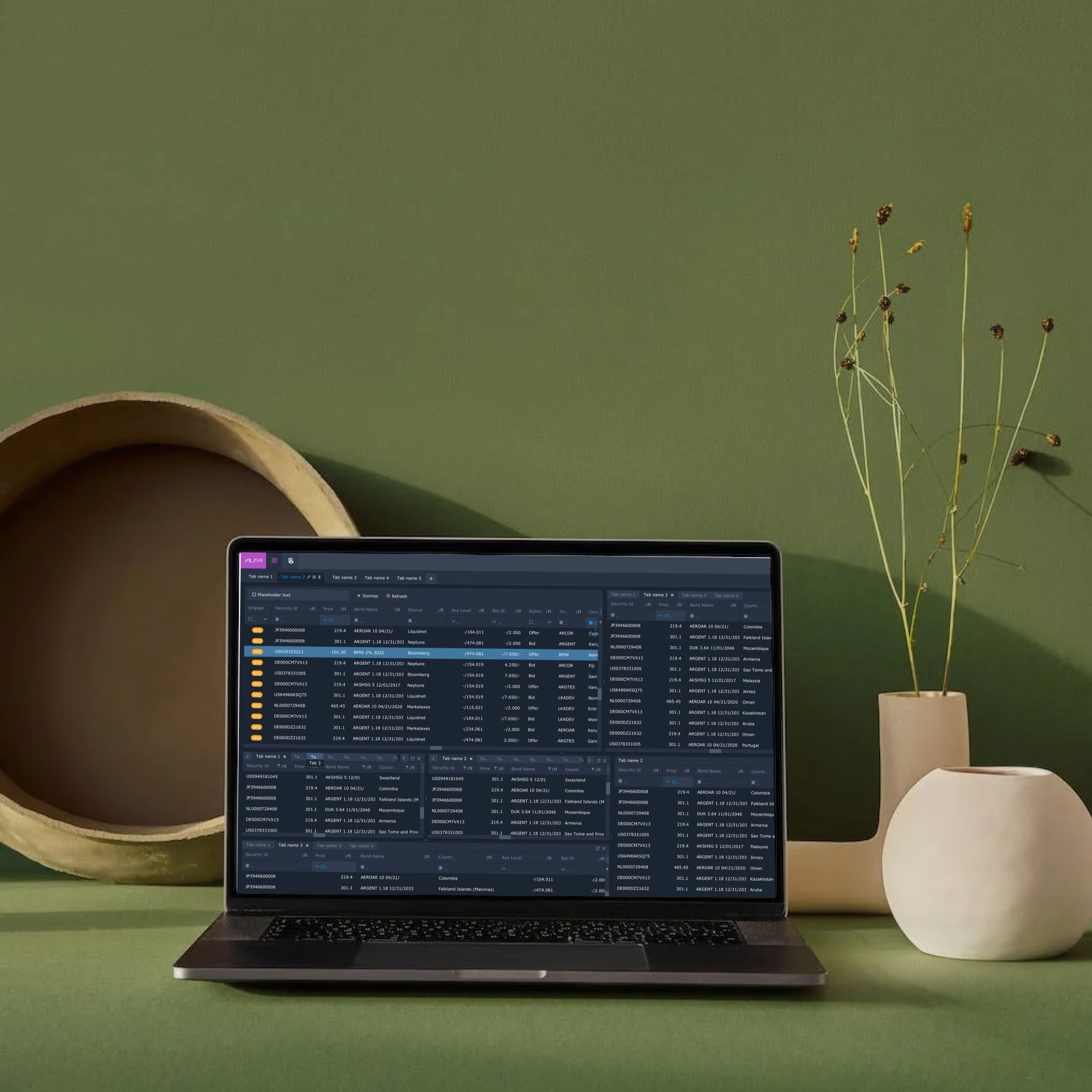
Digital Identity Platform
Connecting Bond Trading Efficiency with User-Centric Design
Project Type
Bond Trading Platform Redesign
Scope of Work UX Research, UX/UI Design, Wire-framing, Usability Testing, Information Architecture
Tools Figma, Atomic Design Principles, Data-Driven Insights, Real-Time Data Visualisation
Domain
Financial Trading & Market Data Analysis
The Story of the ALFA Data Grid Redesign
In the high-stakes world of bond trading, where every second counts and market shifts can happen in the blink of an eye, traders at Algomi ALFA were facing an uphill battle. They were drowning in data, navigating complex systems, and constantly switching between platforms just to execute a single trade. The tools meant to empower them were instead slowing them down.
That’s where this story begins—with a challenge that demanded clarity, speed, and precision (and maybe a bit of design magic).
The Turning Point: Why the Redesign Was Essential
Imagine trying to win a race with ankle weights on—that’s what trading on ALFA felt like. Powerful? Yes. Practical? Not so much. Traders struggled with cluttered dashboards, slow navigation, and an overwhelming avalanche of information. Every click felt like a detour.
Our mission? Transform ALFA from a sluggish obstacle course into a sleek, high-speed expressway for traders. This wasn’t about adding flashy buttons—it was about cutting through the noise and delivering an intuitive, trader-first experience.
Our Goals
Cut trade execution time by 40% (because seconds matter).
Boost trader satisfaction by 25%.
Break free from external tool dependency by integrating core functions directly into ALFA.
“It feels like I’m working on a spreadsheet rather than a trading tool.”
– A Trader’s Feedback
Design Thinking in Action: The Adventure Begins
We didn’t just dive in headfirst without a plan. Instead, we followed a tried-and-true methodology: Design Thinking. This human-centered approach allowed us to structure our journey through five key phases: Empathise, Define, Ideate, Prototype, and Test. Each phase brought us closer to uncovering and solving the core issues traders were facing.
Empathise
Contextual Inquiry Report
Cognitive Walkthrough
Heuristic Analysis Report
Personas
User Journey Map
Define
Affinity Mapping
Experience Mapping
Priority Matrix - Impact Vs, Effort
Ideate
Brainstorm Crazy 8s
Wire-frame Workshops
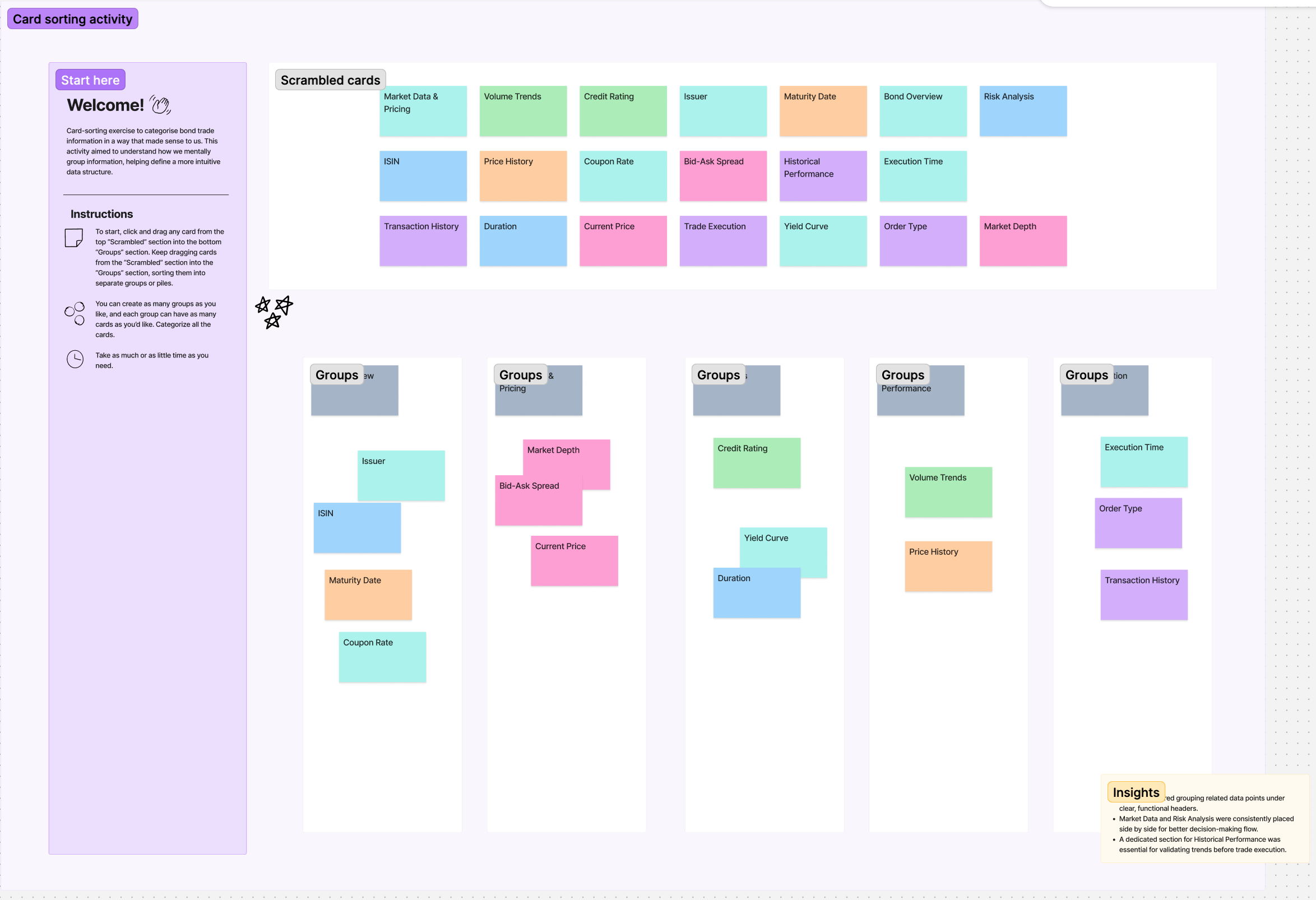
Card Sorting Activity
Sketches
User Flows
Design
The Design System
High-Fidelity Designs
Prototyping
Test
Usability Testing
Feedback & Iterations
Empathise – Stepping Into Traders’ Shoes
Why did we start here? Because understanding the users is the foundation of meaningful design. We needed to walk a mile (or a trade) in their shoes to uncover their frustrations, needs, and desires.
Build empathy with users by learning about their day-to-day struggles and goals.
Understand how different levels of technical expertise influenced their interactions with the platform.
Identify pain points that hindered task completion and overall satisfaction.
Recognize patterns in user behavior and feedback that pointed to areas needing improvement.
Exercises We Used:
Contextual Inquiries:
We shadowed traders in their daily environments, observing their habits and challenges in real-time. This allowed us to identify natural pain points without any interference or bias.
Cognitive Walkthrough
Asking traders to think aloud while completing core tasks.
Identifying friction points where users struggle to complete actions efficiently.
Heuristic Analysis (Jakob Nielsen’s Usability Principles)
Reviewing the legacy system using usability heuristics such as:
Visibility of system status
Recognition vs. recall
Minimalist design
Error prevention
Personas:
We conducted deep-dive interviews to understand traders’ routines, challenges, and expectations from the platform and created personas from insights
Journey Mapping:
We visually mapped out the user journey, highlighting friction points and moments of frustration.
Why These Exercises?
We chose these methods to gather both quantitative and qualitative insights. Shadowing gave us unfiltered access to their true behaviours, while interviews allowed users to express pain points in their own words. Journey mapping, on the other hand, helped us visualise their emotional highs and lows.
Key Discoveries:
Information overload that made traders feel like they were decoding hieroglyphs.
A navigation system so tangled it needed its own map.
A trade execution process slower than a snail on vacation.
Define – Shaping Clear UX Goals
Next, we had to transform these insights into a structured understanding of the core issues. Here, the goal was to synthesise what we learned and define clear objectives for the redesign.
Exercises We Used:
Affinity Mapping:
We grouped pain points into meaningful categories—Data Overload, Navigation Complexity, and Poor Readability emerged as key themes.
Grouping similar pain points from interviews and observations into common themes.
Example clusters:
Data Overload – Too much information on a single screen.
Navigation Complexity – Hard to filter/sort/search.
Poor Contrast & Readability – Small fonts, unclear grouping.
Experience Mapping
Mapping user emotions across the workflow.
Example: “Frustration spikes when traders have to filter and compare trades.”
Impact vs. Effort Matrix:
We categorised ideas based on their potential impact and the effort required for implementation.
Categorizing UX fixes based on:
High Impact, Low Effort → Quick Wins (e.g., font adjustments, better contrast).
High Impact, High Effort → Core Redesign Areas (e.g., multi-panel layout).
Why These Exercises?
These tools allowed us to identify actionable opportunities and align the team around the most important problems to solve. By focusing on high-impact, low-effort tasks first, we could ensure quick wins while planning for larger changes in the future.
Defined UX Goals:
Simplify data presentation for quicker decision-making.
Streamline search and filtering to enhance efficiency.
Integrate bond comparison and trade execution tools directly into ALFA.
Ideate – Let the Creative Sparks Fly
This is where the magic happened. Our goal was to generate as many creative solutions as possible—encouraging bold, unconventional ideas that could reshape the way traders interacted with ALFA. We wanted to break away from traditional constraints and imagine new ways to simplify workflows while maintaining the depth and accuracy traders needed. From rapid-fire sketching sessions to collaborative brainstorming with real users, we embraced divergent thinking to explore multiple paths before narrowing down the best solutions. Every idea was welcome, no matter how wild, because sometimes the most unexpected concepts lead to the biggest breakthroughs.
Exercises We Used:
Crazy 8’s Sketching:
A fast-paced exercise where participants sketched eight ideas in eight minutes, pushing us beyond conventional solutions. This exercise was invaluable because it forced rapid ideation, encouraging participants to think outside of their usual constraints. The time pressure meant that instead of overthinking, they relied on intuition and instinct, which often led to unexpected and innovative ideas.
Wireframe Workshops:
Co-design sessions with traders helped ensure that the solutions were grounded in real-world use cases. These sessions provided a collaborative space where traders could directly influence the structure and usability of the interface. Instead of relying solely on designer intuition, we brought real users into the process, allowing them to sketch out workflows, arrange data elements, and critique early concepts.
Card Sorting:
Traders played an active role in structuring the information hierarchy by organising bond trade data into logical groupings. This hands-on exercise allowed us to observe how users naturally grouped and prioritised different types of information, revealing gaps in our initial assumptions.
Paper Sketches:
We conducted a low-fidelity sketching exercise where traders and stakeholders drew their ideal interface layouts on paper. This raw, unfiltered approach encouraged rapid ideation and surfaced common mental models about how users expected information to be presented.
User Flows:
Mapping out how traders interacted with the platform helped us identify bottlenecks and inefficiencies. By visualising each step of the journey—from searching for bonds to executing a trade—we gained deeper insights into where users got stuck and how we could optimise the experience.
We visually mapped out the user journey, highlighting friction points and moments of frustration.
Why These Exercises?
We wanted to foster creative freedom while keeping trader needs at the core. The collaborative workshops ensured that user insights remained central throughout the brainstorming process.
By analysing and optimising user flows, we ensured that every interaction was purposeful, reducing cognitive load and improving efficiency across the platform. These sessions provided an open forum where designers, product managers, traders, and developers could collaborate in real time, ensuring that solutions were both innovative and technically feasible. By bringing different perspectives into the room, we were able to challenge assumptions and refine ideas quickly, leading to stronger, more validated design concepts.
Key Discoveries:
Rapid Iteration Improves Usability: Initial concepts were overly complex, but repeated refinement through collaborative critique helped simplify interactions without sacrificing functionality.
Traders Needed Customisation: The rigid layout structure of previous iterations didn’t accommodate different trading styles. Traders pushed for drag-and-drop components and modular layouts.
Data Hierarchy Mattered: Visual clarity was a major concern. Participants helped define which data should be emphasised, leading to a prioritisation framework for real-time analytics and historical data.
Micro-interactions Increased Confidence: Subtle feedback elements, such as confirmation states and animated transitions, reassured users when executing high-stakes trades.
Prototype – From Ideas to Reality
This phase was about making ideas tangible. Low-fidelity wireframes and interactive prototypes helped us test concepts quickly without investing too much upfront.
Why These Exercises?
Wireframes allowed us to visualise functionality without being bogged down by aesthetics. Storyboarding brought user journeys to life, ensuring we were solving the right problems at the right moments.
Lo-Fi Wireframes: Basic sketches evolved into interactive digital mockups.
Storyboard User Flows: Visual narratives that mapped out how users would navigate through the platform.
prototype video preferences user interface drag & drop
Test – The Moment of Truth
This phase was critical to validate whether our solutions worked in the real world.
Exercises We Used:
Cognitive Walkthroughs: Traders performed tasks while narrating their thoughts aloud, revealing usability issues in real time.
Usability Testing: Testing core functionalities—search flow, bond comparisons, trade execution, and alerts.
Why These Exercises? We wanted immediate, honest feedback. The cognitive walkthroughs helped us uncover hidden frustrations, while usability testing ensured our designs worked seamlessly under real-world conditions.
The Breakthrough Moments (A.K.A. The Lightbulb Moments)
Our design explorations led to breakthroughs that made us want to high-five each other:
A Data-Focused Dashboard:
Clean, clear, and laser-focused on what traders actually need—real-time bond prices and risk alerts front and centre.
Interactive Alerts Panel:
Colour-coded, prioritised, and—most importantly—not annoying.
Customisable Trade Workspace:
A dashboard that felt like home—because every trader deserves their own command centre.
Innovative Features:
Side-by-Side Bond Comparison: Like comparing apples to apples—but for bonds.
Dynamic Alert Prioritisation: Only the most important alerts get your attention (because who likes unnecessary notifications?).
The Impact: From Frustration to Triumph
The transformation was nothing short of magical:
40% Faster Trade Execution: Like cutting through traffic with a VIP pass.
25% Boost in Trader Satisfaction: Happier traders, better results.
Reduced Dependency on External Tools: ALFA became a one-stop-shop for traders.
Key Lessons Learned:
Simple design equals faster decisions (and fewer headaches).
Personalisation = Happy traders.
Keep listening—because users always know best.
What Could We Have Done Differently?
No story is perfect, and if we had a time machine, here’s what we’d tweak:
Earlier Involvement from Developers: Engaging developers from day one could have helped identify technical constraints early and smooth the transition from design to development.
Broader User Testing Early On: Testing with a wider variety of traders from different backgrounds might have uncovered niche pain points sooner.
More Iterative Prototyping: Faster feedback loops would have helped refine design elements more quickly and efficiently.
Increased Cross-Team Collaboration: Regular workshops with marketing and compliance teams could have surfaced additional user needs and requirements earlier in the process.


